Dashboards
Dashboard widget configuration
Configuration help
Styling
All widgets have a field called "Custom CSS". This allows addition of styling, when that stylesheet is shown.
As of version 8359 it is possible to use #THISWIDGET# to target that specific widget.
#THISWIDGET# will automatically be replaced by the unique html-id of that widget, eg. #Widget69, thus allowing css that can be copied to another widget without the need to know the ID.
Icons
All the below properties are required for the button
Sizing
Length
Setting the length of a widget limits how many rows are shown. This setting only applies to lists.
Size
Setting the height of a widget forces it to be that number, times 100, pixels tall. This setting does not affect lists.
Setting the width of a widget applies a set of bootstrap column-classes, setting the width in a responsive manner.
The lookup follows this logic:
- 1 =
col-4 col-md-2 col-xl-1 - 2 =
col-6 col-md-4 col-xl-2 - 3 =
col-6 col-lg-4 col-xl-3 - 4 =
col-12 col-md-6 col-xl-4 - 5 and 6 =
col-12 col-lg-8 col-xl-6 - 7, 8, and 9 =
col-12 col-xl-8 - 10, 11, and 12 =
col-12 - Above 12 =
col
SQL Query
An SQL Query may extract almost anything from the database.
This process ignores the security restrictions in the system, so you will have to implement them yourself (see special keywords below).
This widget supports different rendering modes, for a deep dive on the diagrams, click here.
Sample: Limited status distribution
The following example displays quite well in a pie chart.
 SELECT s.Status, count(*)
 FROM data_leads1 as d
 JOIN formstatus as s ON  s.StatusID = d.StatusID
 WHERE d.StatusID IN (11344,11343,11345)
 GROUP BY 1
Special keywords / variables
- %UserID%
- %ExclusiveGroupID%
- %GroupListSql%
- %ExclusiveGroupListSql%
- %AndRecordFilter%
SQL query examples
Grouping
The following queies are suitable for use with Dashboard SQL tables. With minor modification they can also be used with the Field type "SQL: Table query"
SELECT s.Status, COUNT(k.DataID)
FROM data_kuglespil as k
JOIN formstatus as s ON k.StatusID = s.StatusID
GROUP BY 1SELECT l.`Value`, COUNT(k.DataID)
FROM data_kuglespil as k
JOIN formfieldlookup as l ON k.STRRELSE = l.LookupID
GROUP BY 1
ORDER BY l.SortOrderGrouped variables
SELECT 'Under 5' as Text, COUNT(k.DataID)
FROM data_kuglespil as k
WHERE k.RESULTAT <= 5

UNION

SELECT 'Middel (6-16)' as Text, COUNT(k.DataID)
FROM data_kuglespil as k
WHERE k.RESULTAT <= 5 AND k.RESULTAT < 17

UNION

SELECT 'Top performer (17)' as Text, COUNT(k.DataID)
FROM data_kuglespil as k
WHERE k.RESULTAT = 17
Population percentages
SELECT
  AVG(IF(StatusID=35,0,100)) as `% completed`
FROM
  data_tpdocument
Corner cases and weird stuff
List of birthdays
SELECT NAVN as Navn, FDSELSDAG as Fødselsdag, ROUND(DATEDIFF(NOW(),FDSELSDAG) / 365 ) as Alder
FROM data_medarbejder
WHERE DATEDIFF( MAKEDATE(YEAR(NOW()),DAYOFYEAR(FDSELSDAG)), NOW() ) BETWEEN 0 AND 7Lists
To setup a list view, simple copy/paste the URL of a view.
Optimally you should strip anything but the parameters from the URL.
?SagID=252&command=list&QUERY_FIELD_1=OPFLGNING& ...Filtering the list
To filter the list, add three parameters to the url, pr filter. Make sure that every set of parameters have their own unique number.
?SagID=252&command=list&QUERY_FIELD_1=OPFLGNING&QUERY_PARAM_1=1&QUERY_VALUE_1=0 ...Operators:
| ID | Command | Note |
|---|---|---|
| 1 | = | Only rows with values equal to |
| 2 | < | Only rows with value lower than |
| 3 | > | Only rows with values higher than |
| 4 | != | Only rows with values not equal to |
| 5 | <= | Only rows with value lower than or equal to |
| 6 | >= | Only rows with values higher than or equal to |
| 7 | CONTAINS | |
| 8 | Starts with | |
| 9 | Ends with | |
| 10 | IS null | |
| 11 | IS NOT NULL | |
| 15 | IN DAY | |
| 16 | IN MONTH | |
| 17 | IN YEAR | |
| 20 | HAS | |
| 21 | HAS NOT | |
| 22 | HAS NONE | |
| 23 | HAS ANY | |
| 24 | IN | Only rows with values equal to one of the given (comma separated list) |
If you are signed in as an admin on a server with a version newer than 7956, you will have access to the "url button".
This might be an easier way to generate the correct url, when creating dashboard-list-widgets.
Special case: List of values in search parameters
Currently lists of search parameters are encoded
... &QUERY_VALUE_3=11344%2C11343%2C11345& ...To make them work in list views, please decode the kommas
... &QUERY_VALUE_3=11344,11343,11345& ...(just change "%2C" to ",")
Dynamic selectors
A special case of the SQL query is the selectors. A selector will allow you to select a value or an ID for use as a parameter in another SQL query or a List view.
A selector will have a name defined by setting its column name in the query
SELECT DataID, CUSTOMER AS SelectedCustomer FROM data_customer WHERE StatusID = 123In this case the value of DataID is set in a user specific variable named SelectedCustomer. The proper notation is in brackets [].
This can now be used in list and SQL definitions
SELECT BILLINGDATE, AMOUNT FROM data_invoice WHERE CUSTOMER = [SelectedCustomer]Other widgets
Codeunit
This widget displays raw HTML ouput from any PageContentCodeunit.
Distribution
This creates one of many diagrams to show records of an entity. Bar, circle, and table diagrams work, but the others don't.
It should at the very least have the SagID of the entity and a QUERY_GROUPBY parameter to know what should be shown. If it does not have this, it will always show the status of the records.
Content should look something like this:
?SagID=3&QUERY_GROUPBY=TOPIC
Pro tips
Asking the right questions
To add the right content into dashboards widgets you will need to define what should be displayed
First choose either List of records (worklists) or Aggregated values (charts, tables or number)
List of records
- Fields displayed in list ?
- Sorting field ?
Aggregated values
- Format ?
- Number
- Table
- Chart (pie,bar)
- Metric ?
- Field
- Method (sum, average, min, max)
- Option: Categorization (group by another fields value)
- Option: Link to detailed data
- URL to link to ?
- Icon on button ?
- Browse | Font awesome version 4 icons
Next consider which filters limit the data
- Period ranges ?
- Status limitations ?
- User relation information ?
In case you are generating normal record lists no effort is required for security filters and hiding deleted items.
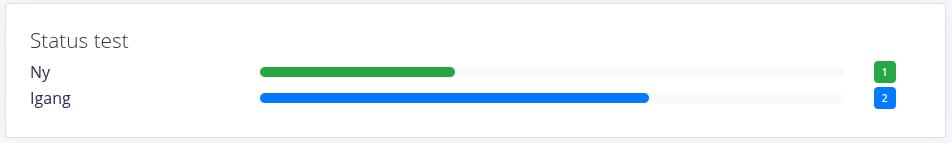
Status Overview
Added in version 11977.
Shows a simple overview of amount of records in different status's (and status groups), with an custom line title and color.
Sample
Configuration
The widget expects the "solution" to be the system name of the entity/solution that data is shown from, and the content to be setup in the following manner.
The css class part is optional.
[Line name]#[Line CSS class]:[Comma-list of StatusID or StatusSystemName]Eg.
New tasks#orange: 57, NEW
In progress#blue: 58
Done#green: 59, DONE
Translation
Add contant-translation formatted like this:
da:Nye opgaver
Igang
Færdig
Styling
The colors green, blue, yellow, orange and red, are defined by default in the platform.
To use a custom color, use a custom css class in the configuration and add the following code to the widgets style.
#THISWIDGET# .my-color .bar .bar-progress {
  background-color: var(--primary);
}
#THISWIDGET# .my-color .badge-col .badge {
  color: #FFF;
  background-color: var(--primary);
}
Styling
Note: Dashboard styling is under development
Dashboard styling
For CSS flex ordering dashboard elements you can add one of these classes to the dashboard
- tsDashboardLayoutRow
- tsDashboardLayoutColumn
Widget styling
The following classes can freely be combined on widgets OR on dashboards
Note that adding the class on a dashboard will affect all included widgets
Common styles
Hide the widget if it is empty
#THISWIDGET#.tsWidgetEmpty { display: none; }
Diagram widget configuration
Get started
This information is also applicable to the field Visual extra: SQL: Diagram query.
This site only describes the specifics of the diagram widgets, for general widget configuration click here.
This article will only cover the newest version of graphs implemented.
To enable these, toggle the Policy useGoogleChart to false and useNewChart to true.
As of writing (version 8813) these renderings are supported.
- Circle
- Doughnut
- Bar vertical (Columns)
- Bar horizontal
- Area
- Line
- Area (stacked)
Data and Internationalization
An SQL Query may extract almost anything from the database.
This process ignores the security restrictions in the system, so you will have to implement them yourself.
Structure
The structure is the same for all graphs.
The first row of data will be used for headers.
The column named "Title" will be used for titles. On circular diagrams that is the labels, next to the chart, and on xy-graphs that is the labels on the x axis.
The rest of the headers will be used when hovering over the graph, to give information about the data. On xy-graphs it will also be displayed as labels.
The rest of the lines in the data will be added as datapoints in the graph.
If the datapoint is a number, the graph will auto-scale to match the data.
Strings are also supported, but the outcome is unknown.
If a datapoint is null, the graph will bridge the gap, if it is an xy-line-graph, see sample here.
Sample pie/doughnut-graph
| Title | TitleEnglish | This moth | Last month |
|---|---|---|---|
| GOOG | Alphabet | 100.23 | 25.23 |
| TSLA | Tesla | 10.23 | 20.23 |
| AAPL | Apple | 50.23 | 50.23 |
Sample line-graph
| Title | TitleEnglish | Alphabet | Tesla | Apple |
|---|---|---|---|---|
| THIS | This Month | 100.23 | 10.23 | 50.23 |
| LAST | Last month | 25.23 | 20.23 | 50.23 |
Multiply y-axis
Multiple y-axis are supported as of version 9390.
To use this feature, prepend the name of the new axis to the data that should be on that axis, eg y1|Apple.
The default y-axis is named y. If no axis is specified, this will be used.
You can specify as many axis as ChartJS supports.
Post-Parsing data
There is two possible post-processing methods available. They can't be combined.
Transpose
Start the query with a line containing: -- @TRANSPOSE
This transposes (inverts columns and rows) the data fetched by the query, before handing it of to the chart-engine.
Parse
Start the query with a line containing: -- @PARSEDATASET
This expects the query to generate data in the following format (headers are optional), and removes the support for links.
| X-axis | Group by | Y-axis |
|---|---|---|
| 2024 | Sales | 2000 |
| 2024 | Budget | 2000 |
| 2025 | Sales | 2500 |
| 2025 | Budget | 4000 |
| 2026 | Budget | 5000 |
Internationalization
Add extra columns named "Title", followed by the name of the language, eg TitleEnglish.
If a column with this name is found, it will be used, otherwise the grath will fallback to the "Title" column.
If no title-column is found, the first column will be used, for compatibility reasons.
Adding functionality
It is possible to add some simple funktionality to charts, by adding links.
This feature is limited to one link pr x-axis value.
To add a link, add a column named "Link" to the query.
Whatever this column contains will become a link, that can be navigated to, when that x-value is clicked.
Graph defaults
The graphs all reference the js object tsChartDefaultOptions, with a couple of tweaks.
To see the defaults, open the terminal in you browser, on a page that has a graph and type the name of the object.
Specifik defaults
These can't be overwritten.
Area stacked
options.scales = {
  y: {
    stacked: true
  }
}
Area stacked, area and line
options.interaction = {
  intersect: false,
  mode: 'index',
}
Bars
options.indexAxis = 'y'Stacked bars and cols
options.scales = {
  x: {
    stacked: true,
  },
  y: {
    stacked: true,
  },
}
options.plugins = {
  tooltip: {
    callbacks: {
      footer: items => {
        return 'Total: ' + items.reduce((a, b) => a + b.raw, 0)
      },
    },
  },
}
Overwriting defaults
To overwrite the default of all charts:
Define an object in js, named tsChartOverwriteOptions.
Set it based on the documentation fund here.
To overwrite the options for a specific chart:
Define an object in js, named tsChartOverwriteOptions.
Add an object with an index matching the chartID.
Set it based on the documentation fund here.
To test your overwrite:
From the console in the browser call tsChartOptions with the only parameter being the chartID.
The return will be the final options, that will be used for that chart.
Sample
Force a graph (graph with ID 6) to always have y-axis start at 0.
let tsChartOverwriteOptions = {
  chart6: {
    scales: {
      y: {
          beginAtZero: true
      },
    },
  },
}
Change the color of the labels to red (graph with ID 4).
let tsChartOverwriteOptions = {
  chart4: {
    plugins: {
      legend: {
        labels: {
          color: "rgba(255, 0, 0, 0.9)",
        },
      },
    },
  },
}Colors
The colors used, can be overwritten in the Policy diagramChartJSColors.
The structure of the policy is very strict.
The policy has to be formatted as a js array of strings that represent an rgb color.
Thus: It has to start with [ and and with , ].
Each color has to be formatted as an rgb color and wrapped with ', and separated by , eg 'rgb(255, 255, 255)', for a white color