Basic
Basic fields that just store some information or do not require much, if any, configuration.
- Package name: basic
- Integer
- Decimal
- Percentage
- Yes/No
- Serial
- Response
- Enumeration
- Symbol
- Date
- Time
- Datetime
- Month
- Year
- Text
- Text multiline
- Notepad
- Hierachy/tree
- Website (URL)
- Unique key (GUID)
- Text with lookup
- Phone
- CPR nummer
- CVR nummer
- Static content
- Static button
- Static message
- Static script
- Script function
- Priority
- Currency
Integer
Capable of containing whole numbers (no decimals).
Due to technical limitations the number can't be smaller than -2.147.483.648 or larger than 2.147.483.647.
Properties
- Type: Basic
- Groupable: No
- Show in lists: Yes
- Searchable: Yes
- Requires configuration: No
User interface
Field in show mode

Field in edit mode

Configuration

Developer info
- FeltTypeID: 10
- SQL datatype: INT(11)
- Class name: FieldNumberInteger
Decimal
Numbers with decimal comma
Properties
- Type: Basic
- Groupable: No
- Show in lists: Yes
- Searchable: Yes
- Requires configuration: No
User interface
Field in show mode

Field in edit mode

Configuration

[Mangler forklaring af "Use category styling" samt link til side om hvad category betyder i platformen]
Default precision is 2, if nothing else is set.
Developer info
- FeltTypeID: 11
- SQL datatype: DECIMAL(20,6)
- Class name: FieldNumberDecimal
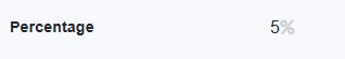
Percentage
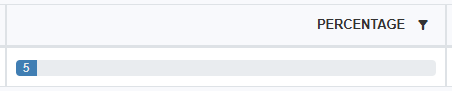
This field is used to show a bar in list views as seen below. It should only be used with whole percentages between 0 and 100. When using this field with formulas the value is not automatically divided by 100, which means that a value of 5% is interpreted as "5".
Note that the policy "showPercentageAsBar" must be true for the field to be rendered as a bar. See Rendering policies
Properties
- Type: Basic
- Groupable: No
- Show in lists: Yes
- Searchable: Yes
- Requires configuration: No
User interface
Field in show mode
Field in list mode
Field in edit mode

Configuration
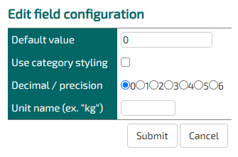
Decimal/ precision does not work on this field
Defining a unit name replaces the default unit of "%".
Developer info
- FeltTypeID: 12
- SQL datatype: DECIMAL(10,4)
- Class name: FieldNumberDecimalPercent
Yes/No
Check box. Yes/No. The values can be shown with other words or icons
Properties
- Type: Basic
- Groupable: Yes
- Show in lists: Yes
- Searchable: Yes
- Requires configuration: No
User interface
Field in show mode

Field in edit mode

Configuration
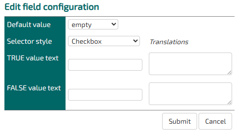
As of version 9943 adding a TRUE value text, when displaying the field as a checkbox, the value will be used as a label for the checkbox.
[Description of configs]
Developer info
- FeltTypeID: 13
- SQL datatype: TINYINT(1)
- Class name: FieldNumberBoolean
Serial
Unique serial number
Properties
- Type: Basic
- Groupable: Yes
- Show in lists: Yes
- Searchable: Yes
- Requires configuration: no
User interface
Field in show mode

Field in edit mode

Configuration
[Description of configs]
Developer info
- FeltTypeID: 16
- SQL datatype: INT(11)
- Class name: FieldSerial
Response
Interval in questionnaire
Properties
- Type: Basic
- Groupable: No
- Show in lists: Yes
- Searchable: Yes
- Requires configuration: [Yes/No]
User interface
Field in show mode

Field in edit mode

Configuration

[Description of configs]
Developer info
- FeltTypeID: 17
- SQL datatype: INT(11)
- Class name: FieldNumberIntegerResponse
Enumeration
Named numbers ex. Grades
Properties
- Type: Basic
- Groupable: Yes
- Show in lists: Yes
- Searchable: Yes
- Requires configuration: Yes
User interface
Field in show mode
[INSERT IMAGE]
Field in edit mode
[INSERT IMAGE]
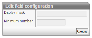
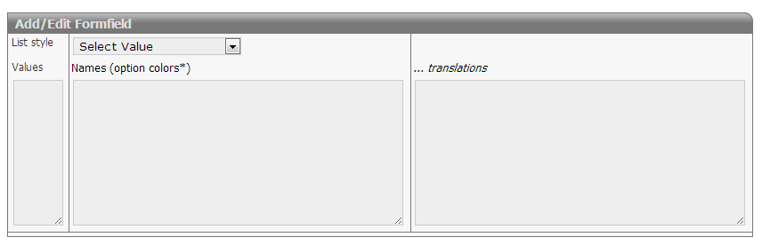
Configuration
Required:
- Values must be integers
- There should be one name for each value
Options:
- Options van be colored using the # syntax
 Option 1 #red
 Option 2 #blue
 ...
- Translations should be prefixed only once with the language qualifier
 en:Option 1
 Option 2
 Option 3
 ge:Wahl 1
 Wahl 2
 Wahl 3
Developer info
- FeltTypeID: 18
- SQL datatype: INT(11)
- Class name: FieldNumberIntegerEnumeration
Symbol
Use icons as status flow and categories
Properties
- Type: Basic
- Groupable: Yes
- Show in lists: Yes
- Searchable: Yes
- Requires configuration: Yes
User interface
Field in show mode

Field in edit mode

Configuration
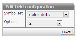
[Description of configs]
Developer info
- FeltTypeID: 19
- SQL datatype: INT(11)
- Class name: FieldNumberIntegerGlyph
Date
Date with calendar look-up
Properties
- Type: Basic
- Groupable: Yes
- Show in lists: Yes
- Searchable: Yes
- Requires configuration: No
User interface
Field in show mode

Field in edit mode

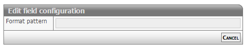
Configuration
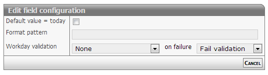
Show mode
The date will be formatted as defined in format option.
Default formatting is: dd/mm/yyyy
Edit mode
The date field will display a textbox. On activating the field a date selector will popup below the field.
Normal input format is: dd/mm/yyyy
The values for dd and mm can be either 1 or two digits - examples
- 1/12/2013 or 01/12/2013
- 31/1/2013 or 31/01/2013
The separator method is also free: "/" or "-" will do
Relative date
The date output can be changed to output the number of dates between the stored date and "now".
To do this input two colors, separated by a space, in the formatting config.
eg. red green.
This will change the list-output of the field to be a number of days.
If the number is negative, the date is in the past, if it is positive the date is in the future.
The two colors chosen will be be added as text-colors.
Other options
The date field can be set to strict or loose date parsing:
- Strict: Only the correct date format supplied by the date selector dd/mm/yyyy
- Loose: Interpretation of all values
- 31/12 > 31/12/[this year]
- 311213 > 31/12/2013
- 30 > [30 days from now]
- -7 > [7 days ago from now]
The loose option is activated by setting the configuration (policy): doSmartDateInput
Styling relative dates
As of version 11476.
The relative date output has the class relativeDate and depending on wether the date is before or after now, it has the class before or after.
To spice up the style of this output, you can add this snippit to your stylesheet.
.relativeDate.after {
    color: #096f58 !important;
    background: #7efbb7;
    padding: 0px 5px;
    border-radius: 3px;
}

.relativeDate.before {
    color: #a7175f !important;
    background: #ffc9d3;
    padding: 0px 5px;
    border-radius: 3px;
}
To limit the styling to a singe entity, add the style in the headers and scripts for that entity.
Developer info
- FeltTypeID: 20
- SQL datatype: DATE
- Class name: FieldTimeDate
Time
Selector for point in time
Properties
- Type: Basic
- Groupable: No
- Show in lists: Yes
- Searchable: Yes
- Requires configuration: No
User interface
Field in show mode

Field in edit mode

Configuration
[Description of configs]
Developer info
- FeltTypeID: 21
- SQL datatype: TIME
- Class name: FieldTimeTime
Datetime
Date with calendar/time look-up
Properties
- Type: Basic
- Groupable: Yes
- Show in lists: Yes
- Searchable: Yes
- Requires configuration: No
User interface
Field in show mode

Field in edit mode
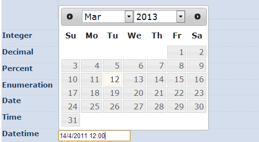
Configuration
[Description of configs]
Developer info
- FeltTypeID: 22
- SQL datatype: DATETIME
- Class name: FieldTimeDatetime
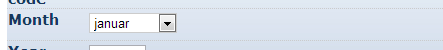
Month
Choice of month, including translation
Properties
- Type: Basic
- Groupable: Yes
- Show in lists: Yes
- Searchable: Yes
- Requires configuration: No
User interface
Field in show mode

Field in edit mode
Configuration
No configuration required for this field type
Developer info
- FeltTypeID: 24
- SQL datatype: INT(11)
- Class name: FieldTimePartMonth
Year
Choice of year
Properties
- Type: Basic
- Groupable: Yes
- Show in lists: Yes
- Searchable: Yes
- Requires configuration: No
User interface
Field in show mode

Field in edit mode

Configuration
No configuration required for this field type
Developer info
- FeltTypeID: 25
- SQL datatype: INT(11)
- Class name: FieldTimePartYear
Text
A single line of a text (ex. Name).
The text can't be longer than 255 characters.
Properties
- Type: Basic
- Groupable: No
- Show in lists: Yes
- Searchable: Yes
- Requires configuration: No
User interface
Field in show mode

Field in edit mode

Configuration

[Description of configs]
Developer info
- FeltTypeID: 30
- SQL datatype: VARCHAR(255)
- Class name: FieldText
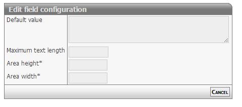
Text multiline
Multiple lines of text (ex. Adresses)
Properties
- Type: Basic
- Groupable: No
- Show in lists: Yes
- Searchable: Yes
- Requires configuration: No
User interface
Field in show mode
[INSERT IMAGE]
Field in edit mode
[INSERT IMAGE]
Configuration
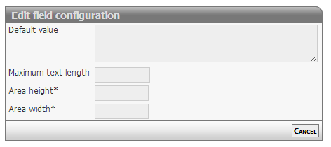
[Description of configs]
Developer info
- FeltTypeID: 31
- SQL datatype: TEXT
- Class name: FieldTextMemo
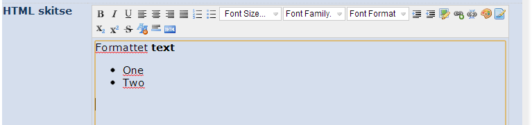
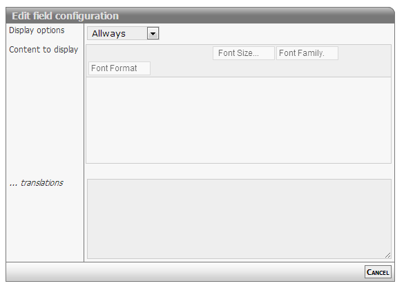
Notepad
WYSIWYG Editor shown in the interface
Properties
- Type: Basic
- Groupable: No
- Show in lists: Yes
- Searchable: Yes
- Requires configuration: No
User interface
Field in show mode
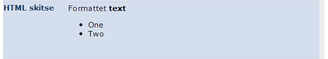
Field in edit mode
Configuration
[Description of configs]
Developer info
- FeltTypeID: 32
- SQL datatype: TEXT
- Class name: FieldTextMemoEditor
Hierachy/tree
Hierarchy of values
Properties
- Type: Basic
- Groupable: Yes
- Show in lists: Yes
- Searchable: Yes
- Requires configuration: Yes
User interface
Field in show mode

Field in edit mode
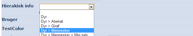
Configuration
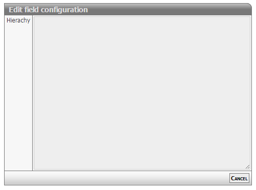
[Description of configs]
Developer info
- FeltTypeID: 33
- SQL datatype: VARCHAR(255)
- Class name: FieldTextHieraki
User email-adress
Properties
- Type: Basic
- Groupable: No
- Show in lists: Yes
- Searchable: Yes
- Requires configuration: No
User interface
Field in show mode

Field in edit mode

Configuration
No configuration required for this field type
To make the field enforce that the input is an actual email, add the following regex as validation.
^[a-zA-Z0-9._%+-]+@[a-zA-Z0-9.-]+\.[a-zA-Z]{2,}$Developer info
- FeltTypeID: 34
- SQL datatype: VARCHAR(80)
- Class name: FieldTextEmail
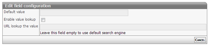
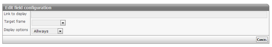
Website (URL)
Stores an internet address.
Properties
- Type: Basic
- Groupable: No
- Show in lists: Yes
- Searchable: Yes
- Requires configuration: No
User interface
Field in show mode

Field in edit mode

Configuration
[INSERT IMAGE]
One configuration is available.
If Configuration1 is equal to "1", then the value will be displayed as a link in lists. The link will open in a new tab.
Developer info
- FeltTypeID: 35
- SQL datatype: TEXT
- Class name: FieldTextURL
Unique key (GUID)
Global Unique ID (GUID) for records, inserted automatically on record creation.
Properties
- Type: Basic
- Groupable: No
- Show in lists: Yes
- Searchable: Yes
- Requires configuration: No
User interface
Field in show mode
[INSERT IMAGE]
Due to its nature this field has no special editing mode.
Configuration
[INSERT IMAGE]
[Description of configs]
Developer info
- FeltTypeID: 37
- SQL datatype: VARCHAR(80)
- Class name: FieldUniqueIdentity
Text with lookup
A single line text with look-up in exciting values
Properties
- Type: Basic
- Groupable: No
- Show in lists: Yes
- Searchable: Yes
- Requires configuration: No
User interface
Field in show mode
[INSERT IMAGE]
Field in edit mode
[INSERT IMAGE]
Configuration
[Description of configs]
Developer info
- FeltTypeID: 38
- SQL datatype: VARCHAR(80)
- Class name: FieldTextSuggest
Phone
Phone number with the possibility for look-up
Properties
- Type: Basic
- Groupable: No
- Show in lists: Yes
- Searchable: Yes
- Requires configuration: No
User interface
Field in show mode

Field in edit mode

Configuration
[Description of configs]
Developer info
- FeltTypeID: 40
- SQL datatype: VARCHAR(80)
- Class name: FieldTextPhone
CPR nummer
Validation of control digits with the personal identification number
Properties
- Type: Basic
- Groupable: Yes
- Show in lists: Yes
- Searchable: Yes
- Requires configuration: No
User interface
Field in show mode

Field in edit mode

Configuration

[Description of configs]
Developer info
- FeltTypeID: 41
- SQL datatype: VARCHAR(12)
- Class name: FieldTextCPR
CVR nummer
CVR number with look-up in the CVR register
Properties
- Type: Basic
- Groupable: No
- Show in lists: Yes
- Searchable: Yes
- Requires configuration: No
User interface
Field in show mode

Field in edit mode

Configuration
No configuration required for this field type
Developer info
- FeltTypeID: 42
- SQL datatype: VARCHAR(10)
- Class name: FieldTextCVR
Static content
A static message/information, that supports translation.
Properties
- Type: Basic
- Groupable: No
- Show in lists: No
- Searchable: No
User interface
Field in show mode
[INSERT IMAGE]
Due to its nature this field has no special editing mode.
Configuration
[Description f configs]
Developer info
- FeltTypeID: 600
- SQL datatype: Special
- Class name: FieldContentStatic
Static button
Button with functionality
Properties
- Type: Basic
- Groupable: No
- Show in lists: Yes
- Searchable: No
User interface
Field in show mode
[INSERT IMAGE]
Due to its nature this field has no special editing mode.
Configuration
[Description of configs]
Developer info
- FeltTypeID: 601
- SQL datatype: N/A
- Class name: FieldContentButton
Static message
Notification on top of the page
Properties
- Type: Basic
- Groupable: No
- Show in lists: No
- Searchable: No
User interface
Field in show mode

Due to its nature this field has no special editing mode.
Configuration

[Description of configs]
Developer info
- FeltTypeID: 602
- SQL datatype: N/A
- Class name: FieldContentMessage
Static script
Execution of the code when changing other boxes
Properties
- Type: Basic
- Groupable: No
- Show in lists: No
- Searchable: No
User interface
This field is not displayed as a normal field.
Due to its nature this field has no special editing mode.
Configuration

[Description of configs]
Developer info
- FeltTypeID: 603
- SQL datatype: N/A
- Class name: FieldContentScript
Script function
Execution of javascript with value insertion into other fields
Properties
- Type: Basic
- Groupable: No
- Show in lists: No
- Searchable: No
User interface
This field is not displayed as a normal field, nor is the value of it saved and available to codeunits/sql-statements.
Due to its nature this field has no special editing mode.
Configuration
This field requires configuration before deployment.

Input
Is a list of fields, which values will be available as variables in the following function.
If a name contains "!", it will be loaded as a decimal.
So this configuration:
FIELD1 FIELD2! !FIELD3Results is this code:
let FIELD1 = getValue("FIELD1")
let FIELD2 = getDecimal("FIELD2")
let FIELD3 = getDecimal("FIELD3")
Plus all those fields will trigger a re-evaluation of this field, whenever they are updates/changed.
Code (Function)
The actual javascript that modifies the data collected from the inputs.
Is pasted into a function, so should only contain lines of code.
Must have a return statement!
Sample:
return FIELD2 * FIELD3;Output
The field to set the value of, with the return value of the final function.
The output of the function will also be the value of this field, but will not be saved, as this field is virtual and only works in the frontend.
Developer info
- FeltTypeID: 620
- SQL datatype: N/A
- Class name: FieldContentFunction
Priority
[DESCRIPTION]
Properties
- Type: Basic
- Groupable: [YES/NO]
- Show in lists: [YES/NO]
- Searchable: [YES/NO]
User interface
Field in show mode
[INSERT IMAGE]
Field in edit mode
[INSERT IMAGE]
Configuration
[INSERT IMAGE]
[Eventuel beskrivelse af configs]
Developer info
- FeltTypeID: 752
- SQL datatype: INT(11)
- Class name: FieldNumberIntegerPriority
Currency
UNDER DEVELOPMENT
[DESCRIPTION]
Properties
- Type: Basic
- Groupable: [YES/NO]
- Show in lists: [YES/NO]
- Searchable: [YES/NO]
User interface
Field in show mode
[INSERT IMAGE]
Field in edit mode
[INSERT IMAGE]
Configuration
[INSERT IMAGE]
[Eventuel beskrivelse af configs]
Developer info
- FeltTypeID: 14
- SQL datatype: DECIMAL(20,2)
- Class name: FieldNumberDecimalCurrency